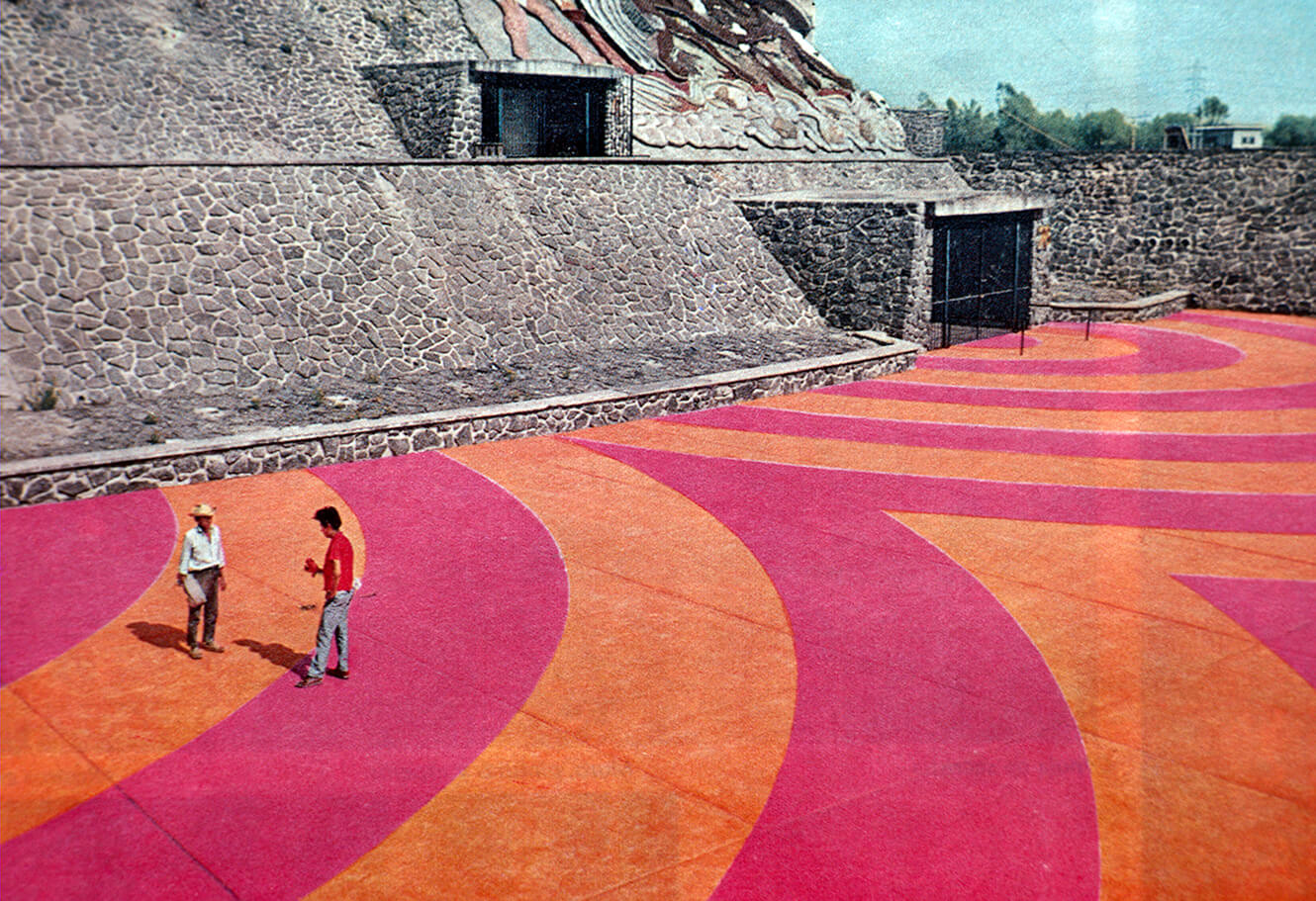
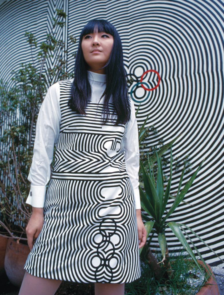
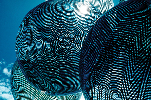
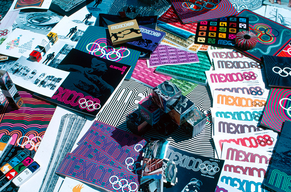
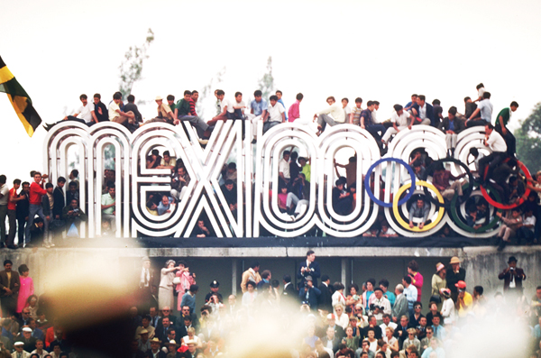
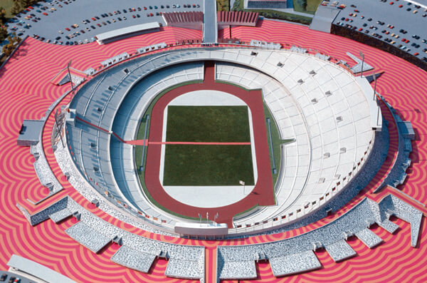
In 1966, at age twenty-nine, Lance Wyman, a New York-based graphic designer bought a one-way ticket to Mexico City to bid for the graphic identity of the 1968 Summer Olympics, the first games ever hosted by a Latin American country. Following ten days of immersive research, Wyman developed a winning campaign that combined the stylings of pre-Hispanic and Mestizo art, local sign painting, and 1960s Op Art. Referencing the black-and-white and vibrantly colored palettes of Huichol yarn paintings, Wyman’s reverberating lines blanketed logos, uniforms, banners, wayfinding materials, and even the stadium’s surroundings with a universally legible geometry suggesting the vibratory confluence of ancient and modern. The graphics performed a timely national identity for modern Mexico that was informed by recent economic growth and what was characterized as a harmonious integration of indigenous, post-colonial, and Mestizo cultures. An expressive and visually successful synthesis of disparate influences, Wyman’s campaign became an exemplary case study of branding and wayfinding design as well as the cornerstone of his pioneering career.
An unforeseen impact of Wyman’s Olympic identity was how it converged with the surrounding political events of Mexico City as the 1968 Olympic games became the focus of an escalating student movement intent on exposing a corrupt government and nationalist elite for whom the games were an opportunity to advance the international perception of Mexico. Following a series of massive protests and violent repression by the government, Wyman’s graphic language—including the ’68 logo and the dove of peace—plastered the city for a second time when it was subverted by the students as the iconography of protest.
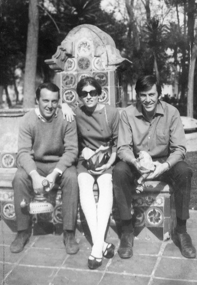
Wyman remained in Mexico City four-and-a-half more years, designing the identities for the metro system and the 1970 World Cup. Fifty years later, his connection to the city and its influence on his work is palpable. On the occasion of Per Diem’s feature on Mexico City, I met with Lance at his studio on the second floor of the home he shares with his wife Neila. The interview concluded with a trip upstairs to see their collection of ceremonial masks from Jalisco, which lines the living room floor-to-ceiling, followed by huipiles from Mexico and Guatemala on the floor above and an extensive assortment of Talavera ceramics in the kitchen. When we finally checked the time, we realized many hours had passed since we first sat down at Lance’s drafting table—a testament to his inviting disposition and lucid recollections of Mexico City.
Given the extent of your work and travel there, I imagine Mexico City must hold a special place in your heart.
Lance Wyman: Yes, it does and it’s funny to think that when it began, I knew so little about Mexico that the extent of my cultural exposure was basically piñatas.
What was that like, arriving as a 29-year-old designer in a country you knew so little about?
LW: Well, we arrived in December and were invited to a Christmas party and they had a piñata. I went to my wife and said, “see, told ya!” (laughs). I’m just joking, but in truth, it was exciting. One of the first things I remember is the drive in from the airport to the city. You go through a lot—at that point probably much more than now—of poor areas of the city. And I’m looking out and thinking, “wow this is great, these guys paint their houses!”. They paint the whole house, the doors, and flower pots all in bright colors. I mean all this color; you don’t see that in New York.
Was it easy to convince your wife to move to Mexico City?
LW: I’m not sure. We’d just gotten married and had one-way tickets. I think it was just another adventure.
With two weeks to develop a logo proposal for the games, how did you approach it?
LW: The research was basically the drive in and the colorful environment. Mexico City is such a wonderful, alive city. We were living downtown in the old Hotel Montejo, right in the Zona Rosa. Realizing I needed to learn more about Mexico, I probably spent almost the whole first week in the Museum of Anthropology and just absolutely fell in love with the early cultures and the folk art. It is a wonderful museum because it shows the large number of cultures that exist within the culture. And they break out all the early pre-Hispanic cultures from the Olmecs all the way up until the Aztecs. It was eye-opening. I’d never seen such powerful geometric work that was so consistent. They also had a sense of humor. I would really bet that Walt Disney spent some time in Mexico because you see the origins of some of his characters in pre-Hispanic examples—like exaggerated bats with big round ears like Mickey Mouse.
And then it was a matter of having the pressure of two weeks to do something. They didn’t have a manual so the logo could work closely with the Olympic rings. Now you can’t—there’s a protective shield around it. I realized that the geometry of the rings could be expanded and integrated with the year sixty-eight, and in working that out, it started looking like the things I’d seen in the museum. So you kind of knew you had something. Then all the major names of the installations and stadiums required their own ligatures so it wasn’t easy to get all the spaces working and put together. I recently found my first color sketch from the beginning of those first two weeks—rapidograph ink on vellum—that we would hook up to a printer that was more accurate than computers because we had a room about as big as this (motions to an alcove of his studio) that was the offset camera. I could take stuff down there and my god, everything was so accurate. We were able to create very refined things by working directly—not working to have something printed—but with the recording tools themselves. I had technicians working with me who were fantastic—very visual and skilled.
Did you easily connect the elements of Op-Art with the motifs, colors, and geometry of Mexican folk art traditions?
LW: Yes, it’s the same approach as some of those early cultures used—adding energy by making things radiate and making things vibrate. The Op Art parts are influenced by the work I’d been doing in New York and by the technology that was going down at that point. But what was missing from these graphics were the technical discoveries that happen in weaving. Weaving has similar restrictions to working with pixels on a computer. If you look at early icons from Apple, Susan Kare did a great job with the restriction of the sixteen-by-sixteen-pixel format she had to work with. You get very clever when you have to render expression in such confinement. Once you had more pixels, they started becoming illustrations, and that’s when Apple lost the icon form. Which I think is what Jobs ultimately wanted when he talked about emulating the homey feel of a burning fireplace.
Whereas icons are much more distilled. I’d be scared to ask what you think of emojis…
I like the idea of that type of visual communication and I know everybody likes them. But I don’t like them at all!
I can’t imagine you would!
I mean they’re a segue into visual communication and they’re very effective, so I love them for that. Plus we’re kind of stuck with them right now. But they’re constantly developing and soon someone will come out with a completely different system and that’s where branding comes in and is probably where language is headed. Mountain ranges weren’t the only reason why Latin became Italian, French, Portuguese, Spanish. Language became a segregator, a marker of political status and of all the things that let us screw things up. So maybe a similar thing will happen with visual language but right now we’re like kids with all this stuff. You can still really explore and experiment. And it might be a way of leveling the playing field, I like emojis for that. The more I talk about iconography and the role that that plays, that’s when I really start getting into it…
That’s a great spin on emojis.
Not even Darwin was able to factor language in the theory of evolution. It’s really interesting when you think about it. Now we know that the Neanderthals and the Homosapiens were getting on just fine but what the hell were they talking about? We don’t know when language came in but when we look at examples of communication and recording like the early cave paintings, I mean those things are so beautiful but how else were people communicating? I don’t know how much shamanism or telepathy was involved–things that we just lost because we decided iPhones are better.
So after you won the project, you only had eighteen months to design the entire graphic identity of the 1968 Summer Games. That must have been stressful given the scale.
LW: Well it was stressful—more than we had thought about. Otl Aicher, the designer of the Munich Olympics came through and he was very abrupt. So Otl walks in and he looks around this little office that was covered with paper because we didn’t have room to hang anything—of course this was before computers. Otl just looked at us and said “we’re further ahead than you.” He’s not alive anymore but I never liked Otl for that and I noted to never do that to a young designer—to dish them like that. That’s not good for anybody.
And to think that might have been the least of your challenges, given what was happening politically during that time. Can I ask what it like to be working there during the student uprisings and the Tlateloco Massacre of hundreds of students by Mexican military and police just ten days before the Olympics?
LW: I always felt dirty. At the time I didn’t know how severe it was until my wife told me she saw tanks on Reforma and none of us really knew what was going on until after. It’s a strange feeling to be part of a government that’s out there killing students and you’re not that much older than they are. I didn’t want to see the Olympics get stopped since we’d been working day and night for eighteen months but I was just hoping it would all stop. It was very painful. I love Mexico and feel like it’s my second city.
Do these events shape the meaning of the work in retrospect?
LW: In 1986, I gave a talk at the University of Mexico and the director of the design school came up and gave me a book of student posters and materials from 1968 and said, “I’m sorry it’s taken so long but I want to thank you personally for giving us a visual language.” Apparently the government hadn’t let him publish this thing, but he finally did—he was one of the students out in the streets making posters. I lost it. You know when you break down crying and it just sweeps over you. It was like lifting a big rock off my back. Even now when I talk about it, I can feel it. Sometimes you just don’t know how you’re involved in something, especially something of that scale. That was powerful. I had the chance to work on the Memorial 68 in Tlateloco and did the icon for that—it’s exactly the same as the ‘68 logo except instead the Olympic rings are replaced by a dove rising like a phoenix from the 68. The memorial showcases a lot of things that the government wouldn’t release then.
Do you see any parallels with the political and social tumult of the present?
LW: Now I think it’s different. The group that’s activated is high school-aged. I think they’re going to carry the day because they’re just at that point where the whole world is going to fall on their shoulders and they’re smart enough to realize that. I think the kids are going to grow into it and they’re not gonna stop. They can define their lifetime ahead of them easier than someone who’s been through college or is in college. Somehow I feel the energy of these kids. I felt it in the 60s too but that was an older age group—my age group actually or maybe a little bit younger. But yeah, you can feel it.
Do you still travel to Mexico frequently?
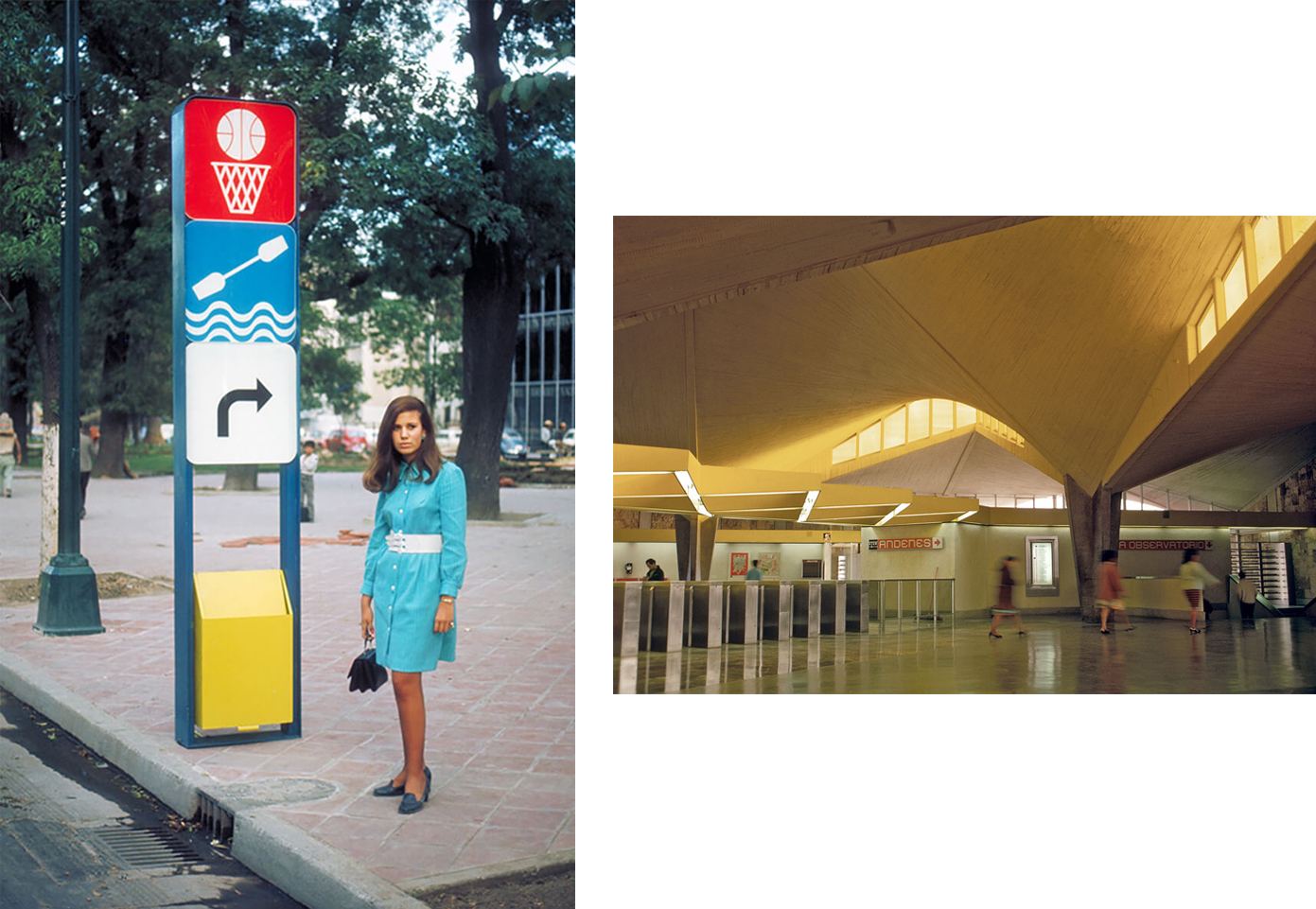
LW: I go down a lot. Especially last year I was involved with Design Week Mexico and now I’m doing some work in Puebla with Uriarte—they are the largest producers of Talavera ceramics, a tradition that originated in Spain where everything has to be so precise—the earth, the clay, the way that the patterns are applied—everything is pretty controlled. I’ve been trying to apply the techniques in a more contemporary genre and it’s been fun. I can show you some examples! I’ve also been working on the graphic identities of new bus and metro lines. It’s a continuation of the metro identity we developed just after the ‘68 Olympics.
What were some considerations in creating that system?
LW: When I first proposed the metro icons—that thing is fifty years old this year—people were concerned it would reinforce illiteracy. That struck me. The Olympics icons weren’t designed in response to illiteracy—they communicated the programming, not just road signs, directionals and different sports. And that’s where I became really convicted about iconography. The original icons are all still there from the first three metro lines that I was initially involved in. As the transportation system grows, they have to add new icons, which keeps me busy. And now they have nine lines that were designed by Mexican designers and a lot of them are as good or better than mine. I had a few bummers in there too. That’s just how it goes.
The bus system combines my designs for the Olympics and the metro. It runs right down Reforma, through the center of the city, so there were a lot of considerations as far as satisfying the interests in those areas. A lot of people objected to a bus route there so we were sensitive about it fitting into the natural environment of Chapultepec Park and so forth. The bus stop structures are dark brown with a green canopy to match the trees. Their posts reference the three-line typography stroke carried over from the Olympics.
What parts of the city do you spend the most time in?
LW: Well god, Mexico City…I love the historic center, the Zócalo since it’s so vibrant and changes with the time of day. You have museums, historical and government buildings and lots of activity, which I’ve always liked. I remember sitting on the roof of a hotel there having a tres colores—lime juice, tequila blanco and red sangrita for the Mexican flag. I remember looking out over a government building and thinking ‘these guys have it figured out.’ I still really enjoy going to the Bazaar Sábado. It’s very commercial but there’s a mix of quality things and so much artisania. I’m also doing some work for Central de Abasto, the wholesale market. I did the original icons for them back in the 80s and now they’re interested in revitalizing the old graphics with a young designer who’s quite good at putting the whole system back together. It has such an interesting history. When I was first down there they didn’t have a Central de Abasto; everyone used the public market, Mercado de la Merced. The Abasto was built in the 80s to accommodate a growing population and now that it’s reached almost twenty-two million, it feeds the whole city. It’s the biggest market in the world if I’m not mistaken. They want to open it up so tourists can go through and see the magic of the place. It hasn’t been designed that way yet, but that’s what they’re working on. And they’ve got murals all around so there’s a nice vibrancy about it.
Where do you stay?
LW: Since I’m usually there for work, I stay in little business hotels that have good conference rooms. They’re just terrific and they’ve really proliferated. There’s one I stay in in Polanco and it’s great. They’re all wired so you can have all the technological stuff you need, like good WiFi.
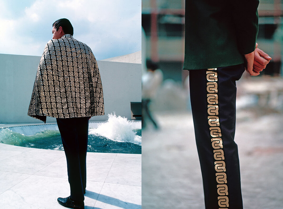
I was looking at some of your designs for hotels—particularly the uniforms for the Camino Real and Presidente hotels. Your designs seem to translate quite well to textiles.
LW: Yeah, that was based on what they do in some of the villages, especially in Oaxaca where they weave narrow belts on little looms with all different patterns. Then they make beautiful huipiles, which is what the women wear and each village has their own patterns. At an art opening I once asked an older woman in her eighties or nineties how she designs these patterns. She said: “Oh I think about our deities, our mythology. I think about the plants we live with and all the things we love in the kitchen. Depending on what I think about, I’ll use that.” I thought that was so cool and natural.
Does wayfinding design inform the way you travel?
LW: No, I get lost all the time. My wife gives me a hard time. I like to think I’m always looking for new things and not finding my way around through the old routes. It’s embarrassing sometimes. I know if can make a map that works for me, there’s a good shot that it will work for anybody.
I know if I can make a map that works for me, there’s a good shot that it will work for anybody.Lance Wyman
What do you love most about Mexico?
LW: The people. There’s a lot of emotional expression in the culture—a sense of humor and direct communication style that when put together with the design and art, it’s just very special. They have one of the biggest convergences of mestizo and indigenous cultures and they hold onto these and blend them in such a strong way. A lot of it’s being lost but it’s coming back too. We also have such an interesting back-and-forth between our two cultures. Like I think Frank Lloyd Wright picked up on what the Mayans were doing and you can see the influence of Mexico in a lot of his work. And I think mine too—not in a scholarly way—-but intuitively and communication-wise.